Redesigning the Web Experience of Japan’s Most Popular Tourist Pass.

VIEW PROTOTYPE

THE BRIEF:
Reimagine or iterate upon a responsive set of flows for an existing travel site.
THE ROLE:
UI/UX Designer & Researcher
THE TIMELINE:
5 Weeks (February - March 2024)
First, let’s set the scene...
Research / User Interviews / Competitor Analysis
The Background
“The Japan Rail Pass (also commonly called JR Pass) is a nationwide rail pass for long-distance train travel in Japan. The pass can be used only by foreign tourists and offers unlimited rides on JR trains for one, two or three weeks.”
-- Japan Guide
The current website for Japan Rail Pass can be found here: https://japanrailpass.net/en/
As someone who traveled to Japan recently and purchased the Japan Rail Pass, I thought it would be an exciting project to tackle-- especially because I remember having issues with the website as a user.
The Problem(s)
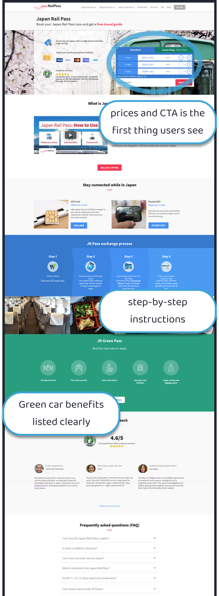
Picture that you’re a first-time traveler planning a trip to Japan and you heard about the Japan Rail Pass. You go to the official website to learn more about it and to see if it’s right for you, but you run into several things that make that task difficult:
The English is unpolished and awkward, and the lines break in unnatural ways, which makes things even more difficult to read.
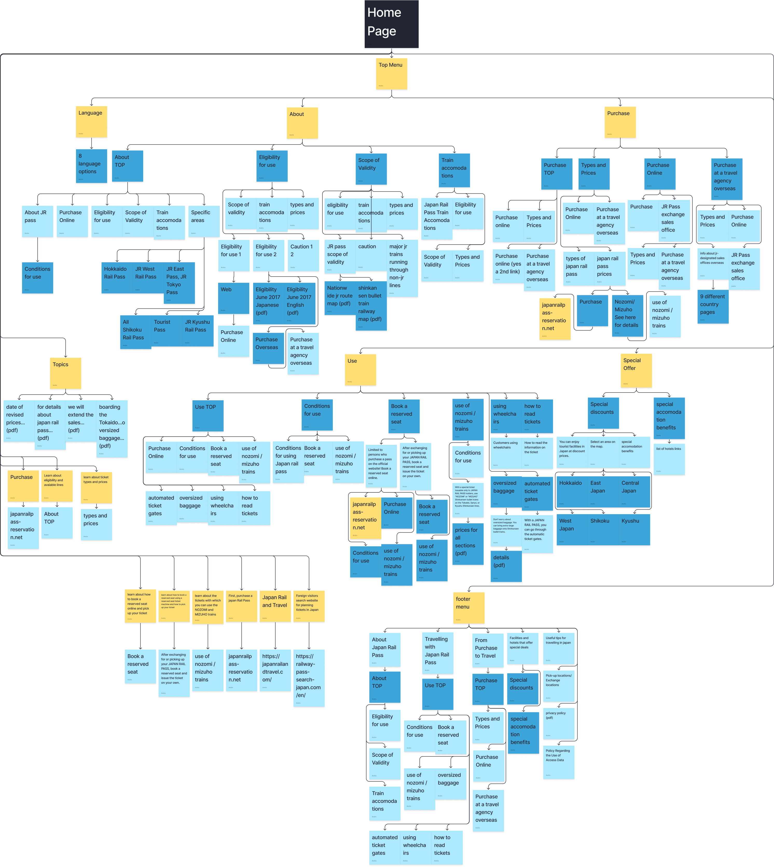
The site overall is poorly organized and there is so much text and fine print on every page.
Finally, it requires you to sign up or log in before you have a chance to see the booking options.
Because of these issues (and perhaps more), you end up making an account and purchasing a pass that is not the best option for your trip. The poor design, copy, and organization of the website made for an overall negative and frustrating user experience. A service that should have made travelling Japan easier is only causing more headaches.
My first step was to validate these concerns about the website. Thus, I began with Usability Testing. I interviewed 5 participants in various age groups with experience traveling, and asked them to complete these tasks on the JR Pass website:
1
Find out what JR Pass is and if they are eligible to buy it
2
Find out pricing
3
Find out the difference between Green and Standard car
4
Find the purchase button
Afterwards, I asked for their overall thoughts on the website. Here’s some of what they had to say:
“This site sucks. Visually it looks fine, but it’s un-intuitive, there’s these huge blocks of text, and it’s just hard to find the info I was looking for.”
“I found the info, but it was not easy to use. Can they please standardize all the fonts and headings?”
“Pretty straightforward, but way too much text. It’s hard to find some of the information. The top menu is really finicky too.”
“It could be more simplified. It’s not super easy. There’s a lot of unnecessary info for tourists. I don’t care for that slideshow on the home screen.”
“Way too much to read on every page. Maybe have all that extra info on a FAQ page. Wording is kinda weird. Like what does “Scope of Validity” mean?”
KEY INSIGHTS
from usability testing
1
Users found the JR Pass website to be hard to navigate and find the information they were looking for
2
Users complained about having to sift through too much text.
3
Some users were not able to find certain pieces of information at all, even if they were present on the site.
Now that I confirmed the issues with the JR Pass website, the next step was to do a Competitive Analysis. So, I compared japanrailpass.net to 2 popular third-party sites where you can purchase JR pass vouchers:
(official 1st party site)
(third-party site)
(third-party site)
KEY INSIGHTS
from competitor analysis
1
3rd party sites handle UI/UX much better, have better English, have prices in USD, and users can complete task and find information more efficiently than the official site
2
On the 1st party site you can reserve shinkansen seats, and you can buy a JR Pass directly, not just a voucher
It's time for solutions.
Sitemap / User Flow / Wireframes
With research completed, I created a new problem statement:
How might we help users of the Japan Rail Pass website quickly understand whether Japan Rail Pass or other regional passes are right for them and their planned trips?
My first step in the redesign was to use the card sorting results to help me redesign the sitemap for japanrailpass.net
This was the old sitemap.

Looking at the site laid out like this, it's no wonder the participants in our usability test had trouble finding what they were looking for!
And here was my redesigned sitemap!

As you can see, it's much cleaner, with most of the key information a new customer may need already available on the home page. Also, the top menu items have been simplified. If users are looking for more specific information, they have the option to search, or to check a dedicated FAQ page.
Then I worked out a primary user flow...
The most important thing for this website to accomplish is to help users decide whether the Japan Rail Pass is right for them, and allow them to purchase it. So, this user flow will take a new user through short sections of the home page that explain what JR Pass is, how it works, and what it includes. This user flow also includes interactive features, like a quiz and a calculator, where users can input information and receive personalized recommendations.
From there, I created low-fidelity wireframes...
...and developed them into a high-fidelity prototype.
The one big new feature I added was the “Is Japan Rail Pass Right for YOUR Trip?” Quiz, which would help people decide on the exact rail pass type for their unique trip, without having to o any extra research.
I also added a Fare Savings Calculator to help users figure out if buying the JR Pass would be cost-effective for their trip. (Not functional in the prototype)
So what did the users think?
Usability Testing / Iterations / High-Fidelity Prototype
And so, I commenced Usability Test #2 with my redesign of the Japan Rail Pass website, but with the same set of tasks for the participants to complete. I also added an opportunity for them to try out the new Quiz feature. And just like last time, afterwards, I asked for their overall thoughts on the redesign.  
Here’s some of what they had to say:
“Much easier to use. Everything short and sweet, only the relevant info.”
“Very straightforward overall. I like there’s no need to read too much fine print.”
“Yeah this is much more streamlined, easy to navigate.”
“Definitely more simple and easy to use.”
But they also had some suggestions to make it even better:
“I didn’t know about the Green vs Standard Pass section til I scrolled down. Maybe make it obvious near the top?”
“maybe have a section with “Step 1” step 2” “step 3” on exactly how to buy JR Pass and when/where to pick up, etc”
“maybe make it more clear at the top of the homepage that it’s for tourists only and not Japanese residents”
“add a ‘jump to top of page’ button at the bottom of pages”
And so, with some minor adjustments...
The circled areas above now act as links that jump the user to the “Green Pass vs. Standard Pass” section of the page.
...I arrived at the final prototype. Which, by the way, is fully responsive:
And now... introducing the new and improved
JAPAN RAIL PASS
Learn how Japan Rail Pass works, what’s included, and the latest perks.
Take the Quiz to see if Japan Rail Pass is right for you.
Explore the differences between Green Pass and Standard Pass.
Use the Fare Savings Calculator to see just how much you’ll save.
Buy your Pass and Reserve seats on Shinkansen bullet trains.
TRY THE NEW & IMPROVED
WEBSITE FOR YOURSELF!

VIEW PROTOTYPE

NEXT STEPS
1
Continue testing and iterating with user feedback
2
Add more user flows, such as the full purchase and reservation flows to work toward an MVP.
3
Prepare files for hand-off to developer team
My Other Work

End-to-end mobile site for Japanese-learners who love manga

End-to-end mobile app to help you explore your local area

End-to-end mobile app to help you explore your local area